
What is important for an accessible internet?
With Smarda, you are perfectly positioned when it comes to creating accessible stores and websites. We are the only system in the world to be certified according to the WCAG 2.2 - AA standard by TÜV Trust IT. Nevertheless, or perhaps precisely because of this, it is important for you as an online professional to know more about the topic. We would therefore like to offer you a "crash course" on the topic of "accessible internet" so that you can advise your customers properly and are equipped accordingly in terms of design and implementation.
The new EU directive:
The aim of internet accessibility is to enable digital participation for people with physical or mental disabilities. In addition to support for screen readers and keyboard control, this primarily concerns design and content aspects - e.g. clear navigation, alt texts for images, transcribed or subtitled videos and sufficient color contrasts and font sizes for visually impaired users. This means that systemic support alone is not enough to make websites and stores accessible. Smarda provides all functions and design options natively and as standard in order to meet all guidelines. This is unique!
The international standard for accessible web content is defined by the "Web Content Accessibility Guidelines (WCAG) whereby WCAG 2.2 - AA is the legal minimum standard for fulfilling the new EU directive (European Accessibility Act).
Under certain conditions, this standard is mandatory for online stores and websites so that people with disabilities are not denied access to the offer. This means that you must take accessibility into account in your projects to avoid problems with the design of your stores and websites - you could face fines of up to 80,000 euros (see current information)!
We cannot go into all the details regarding the law, technologies and functions here. However, we would like to take this opportunity to give all partners who have not yet dealt with these topics an overview of the most important requirements for accessible web design. The basic requirements and functions are briefly explained below:
Technical measures:
The technical requirements to fulfill the legal minimum standard WCAG 2.2 - AA are natively fulfilled by Smarda, but you still need to pay attention to some details when setting up certain settings:
Keyboard control
Keyboard control is a central element of digital accessibility. It enables websites to be operated entirely via the keyboard. All website functions should be accessible and usable without a mouse, using the keyboard alone. This includes navigation, interaction with forms, buttons, menus and other elements. The important thing is:
- All functions can be accessed using the keyboard.
- The Tab key leads logically through interactive elements.
- Enter and the space bar activate links and buttons.
- The focus is always visible.
- There are no "traps" that you can't get out of.
With Smarda, these technical requirements are solved natively, i.e. already preset. You only have influence on the design of the focus for the elements.

Form fields
Forms also need to be clear, understandable and easy to use - even without a mouse. Certain requirements are particularly important for blind people:
- Labels are clear and correctly assigned to each field.
- The tab order is logical.
- Error messages are understandable, clearly visible and barrier-free.
- Input aids such as placeholders or examples provide support when filling in fields.
- The focus jumps visibly from field to field.
These requirements are also solved natively. However, you can of course influence the design of the forms and also the field descriptions and error messages, which also contribute significantly to usability.

Navigation & Sitemap
Good navigation helps users to find their way around the website quickly and easily.
- The menu structure is clear, logical and consistent.
- All pages can be accessed with just a few clicks.
- The navigation can be used via keyboard and screen reader.
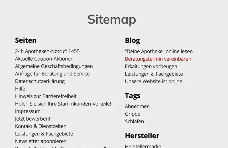
- A sitemap provides an overview of all pages - as an HTML page or linked in the footer.
Every page or content should be directly accessible. A search function or a sitemap that links to all pages should support this. Smarda offers a sitemap function as standard in all templates.
Labeling of buttons & Icons
According to WCAG, all control elements (e.g. input fields, buttons, arrows, etc.) must be clearly and unambiguously labeled so that they can also be read aloud by screen readers for the blind:
- Labels are visible next to the element or are linked in a screen-reader-readable way (WCAG 1.3.1, 2.4.6).
- The label clearly describes what is to be entered or selected.
- Icons or buttons also need a meaningful text alternative (e.g. via aria-label).
These labels are already built into all Smarda control elements. If you add your own elements using embeddings/widgets, you must also ensure this functionality for these.

Design measures:
Smarda's premium templates are designed according to the specifications. This also applies to font sizes and color contrasts. As soon as you intervene in the design, you should therefore be aware of the rules for accessibility:
Sufficient color contrasts
According to WCAG 2.2, texts and control elements must be designed with sufficient contrast so that they are easy to read even if you are visually impaired. Specifically, this applies to the legally prescribed level AA:
- Text must have a contrast of at least 4.5:1 to the background.
- For large text (from 18 pt or 14 pt bold), a contrast of 3:1 is sufficient.
- Information must not be conveyed by color alone (e.g. not just "red" for errors).
Maintaining the contrast can certainly be a challenge for designers. It is therefore advisable to use tools such as the Color Contrast Checker.

Fonts & Text structure
Texts must be easy to read and flexibly adaptable - even on mobile devices.
- Use relative units(em, rem instead of px) so that texts remain scalable.
- Content must be able to be enlarged to 200% without losing functions or content.
- Recommended basic size is 16 px for continuous text.
- No purely text-based information in images.
- Mobile: Content must remain usable even when enlarged without horizontal scrolling.
In addition, text elements should have a correct HTML structure for the orientation of screen readers:
: Main heading - only once per page
: Main sections of the page
: subsections of a section
- ...
to : further levels - but use sparingly
- No jumps in the sequence (e.g. from h1 to h4)

Contrast switch for banners & Slider
Banners and sliders are a popular stylistic device for web designers. With these, the headlines and texts are usually placed above the image. This usually leads to problems with sufficient contrast between the text and the background image. It should be borne in mind that the texts contrast sufficiently with the background in every screen resolution.
This makes it particularly difficult to find suitable images with sufficient contrast in the places where the texts are placed. We have provided the contrast switch in the system for this purpose, which switches to a very high contrast ratio, especially for banners and sliders. You can switch this on if you need it.

Focus for keyboard control
In order to be able to operate a website or store perfectly with a keyboard, the so-called " focus" is crucial, i.e. the display of which link the user is currently on. This is usually a bold frame around the relevant element.
Our premium templates all already have this focus preset. However, you can design it yourself for the focus display on forms. This focus design applies to all form fields and the search field. When designing, make sure that the contrast of the focus is strong enough!

Editorial measures:
Accessible content is not only technically well thought out, but also editorially. The following points should be taken into account when creating texts, images and multimedia content:
Alternative texts (alt texts)
Images and graphics require alternative texts so that blind people can also understand what is being shown:
- Every meaningful graphic needs a descriptive alt text
- The content and function of the image should be clearly explained
Decorative images are given an empty alt="" (not relevant for screen readers) - No repetition of information that is already in the text
- Video/audio content also needs subtitles, transcripts or audio descriptions (depending on the content)
Smarda offers you AI tools for the automated creation of alt texts for your images

Abbreviations & translations
Abbreviations, acronyms, technical terms and foreign-language expressions should be explained for better understanding.
Individual words or sentences in other languages must be provided with the appropriate lang attribute. Avoid untranslated technical terms if they are not generally understandable
Smarda offers the option of adding explanations and translations to the text in the text editor. These text elements are then displayed underlinedon the website and offer the explanatory text on mouseover.
Here are two examples: Mouseover and web accessibility

Recommendations on language style and content
A clear, understandable language style is particularly important for accessible content. Texts should be written in simple, well-structured language - short sentences, active formulations and the avoidance of unnecessary technical terms make it easier for all users to understand.
Link texts also play a central role: they must be meaningful and clearly describe the target content so that they remain understandable outside of the context (e.g. with screen readers).
A logical structure is crucial when designing lists and tables. Tables should be correctly labeled and provided with explanatory headings so that the information they contain remains comprehensible and accessible.
Tools for testing:
A wide range of tools are now available to help you test the accessibility of your websites and stores. We would like to recommend the following:


