
Professional tips for individual design
Smarda is designed so that even beginners can get their store or website up and running with just one click. However, Smarda is used by professionals from the design and marketing scene who need the robust and legally compliant system structure as a professional basis. The focus is usually on individual design and styling for demanding customer projects. Here we would like to show all design professionals quick access to the powerful and at the same time very simple, individual design options.
6 global settings for your concept
If you don't want to use the premium design templates but have planned a completely individual design for your online project, the following steps are very helpful for quickly and efficiently defining your style globally for all elements:
Choose the neutral "Blank" template
If you have a clear, individual idea of your design concept that largely deviates from all premium templates, it is advisable to choose the neutral and slim design template "Blank".
In this template, only a few pages are designed with very reduced, classic styles and minimal placeholder content. This means you hardly need to neutralize any demo content or striking style elements.

Change fonts and use them sparingly
Next, define the appropriate fonts for the corporate design. To do this, change the fonts used in the template in the design editor. Of course, you can also upload your own font families so that they are available for use in all elements.
Important: Keep the number of fonts used small. This not only ensures that your pages load efficiently.

Revise existing colors
When editing your color palette, first use the colors used in the template for certain areas and applications, such as "company color" (= distinctive color of the corporate design), "error message", "background", etc., before adding new, different colors.
The existing colors are already assigned accordingly for each template. If you change these existing colors, this will immediately affect all design elements of your project.

Adjust global settings
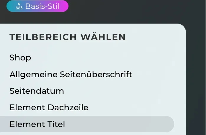
Next, the global settings are essential for centrally defining the style of all design elements used (sliders, banners, galleries, texts, etc.) in just a few simple steps.
Under "Shop" you can define the background color for the store and the font styling for all scrolling texts. This also generally applies to the header, title and subtitle for all elements.
Arrows, dots and pause buttons that appear in sliders, galleries and carousels are also centrally designed, as are bulleted lists, hyperlinks, tables and contrast buttons for banner and slider texts.
Define vertical spacing
The vertical spacing between the sections is a central design element for all pages of your project. Spacing is prepared for this in the templates. You can adjust these and create new ones.
This adjustment allows you to centrally determine the "white space" between the elements. You can also define a standard spacing that is always used when you create a new section on your page.
This central setting is correspondingly powerful, but you can define any individual spacing on the individual pages and overwrite prepared spacing.
In addition to the spacing element, you can of course set outer and inner spacing (margin/padding) for each element and for each section.

System button for all button styles
The system button is the "master template for all buttons that are prepared for the operation of all store elements and forms. All style properties of the system button are automatically inherited by all other buttons. Every change to the system button therefore has a far-reaching effect on the look of your buttons.
However, you can customize the styles of all other function buttons (e.g. shopping cart, checkout, wish list, send form, etc.) that inherit the style of the system button.
In addition, you can create as many of your own button styles as you like, independent of the system button style, so that you can customize the button styling on each page to your liking.


Designing the basic styles:
The initial steps mentioned above may only take a few minutes and have an immediate effect on the overall look and feel of shops or websites. & feel of stores or websites. There are also a few other interventions, such as general corner rounding of images and banner areas, as well as definitions for the icon set, header and footer.
This is the point at which you can turn to the style customization of all style elements that you need for the layout of your content: Sliders, banners, menus, image-text elements, galleries, forms, pop-ups and much more.
You should always be aware of whether you are editing the "base style" of an element in the design editor and not making a style override of a specific element directly at the point on the page where an element uses this base style. As long as you edit base styles, they always have a global effect on all elements that use this base style. However, if you only make a local style override, this only affects the specific element.
For all further steps, we recommend that you obtain information and answers to your questions from our Help Center or contact our professional supportteam: support@smarda.com